
Context
Let's go back in time!
In 2017, when Sketch was the leading design tool, Zeroheight 2.0 was a plugin that helped visualize and share a UI library.
I joined the team as a freelance product designer to help launch Zeroheight 3.0, a new version introducing a no-code editor for design system documentation, seamlessly synced with Sketch.
I collaborated closely with 3 developers, including the co-founders.

Zeroheight 2.0 was a Sketch plugin.

The beta version of Zeroheight 3.0, at the time I onboarded on the project. This version was a webview of a sketch library, without any customization.
Why does Zeroheight exists?
Creating a shareable online documentation for a design system is a tedious task. Before Zeroheight, there was three ways to do it:
Document your system within the design tool
Fast
Synced
Accessible
Document on platforms like Google Docs, Confluence, or Notion
Fast
Synced
Accessible
Document your system on a custom website
Fast
Synced
Accessible
Zeroheight promise was to revolutionize this process by enabling designers to create online documentation in hours (not months!), offering text editor, formatting tools, customization options, and a key feature: Sketch sync.
What is Sketch sync?
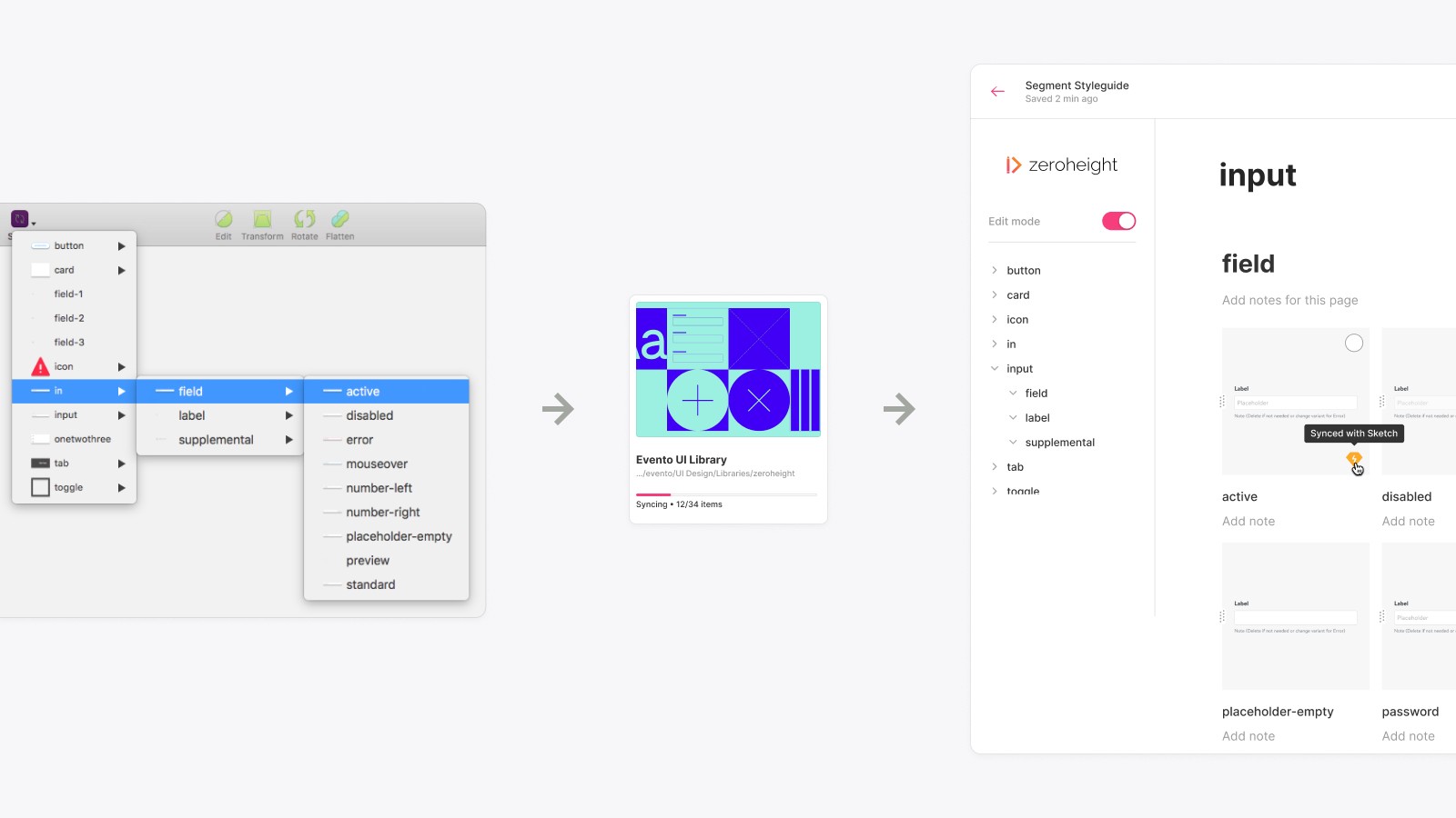
Sketch sync in action: modifying your design in Sketch automatically updates it in the documentation.
Sketch syncing allowed users to avoid the hassle of exporting and updating hundreds of images of their components, specs, and other necessary assets for documentation.
Instead, they could sync the core elements of their design system—styles and components—directly with the documentation.
However, qualitative data revealed that 65% of users didn't even download the plugin, missing the core value of the product.
Hypothesis
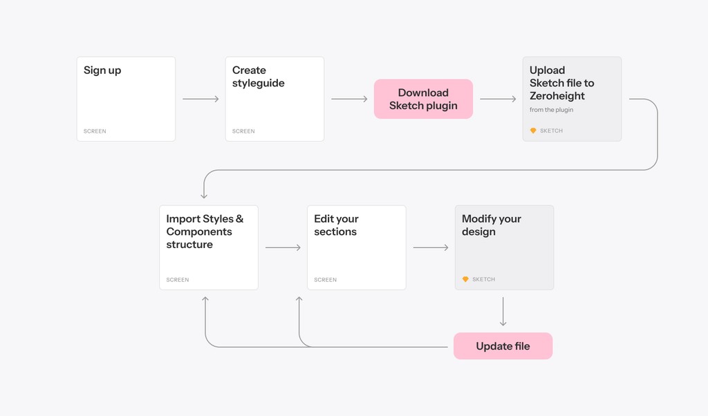
We hypothesized that the lengthy process to reach the "aha!" moment was causing the high drop-off rates. Users had to sign up, download a plugin, upload a file, create a style guide, create a section, and import components. If we reduced or re-arrange those steps, we would reduce drop-offs and double our activation rate.
Objective: create the Sync feature so users get to the "Aha moment" as fast as possible.
Given that Sketch sync was a novel concept at the time, we anticipated that designers might struggle to grasp it. They were accustomed to uploading their artboards to platforms like Invision, Marvel, and Zeplin, rather than extracting a system from their Sketch files.
I researched similar features within (Craft, Plant, Kactus, and Abstract) and outside (Dropbox, Google Drive, iCloud) the design industry. At the same time, I was discussing with developers to figure out technical feasibility.
Exploration
First design iteration
Automatically import the entire file to generate a editable styleguide.
we started by testing the original promise: to create an automatic styleguide in minutes, via importing their entire styles and components structure—characterized by "/" in their design file— and automatically create pages and sections from it.
The first user flow we tested was pushing for uploading their Sketch file before even starting their styleguide.
How their Sketch components structure translates into the styleguide structure automatically.
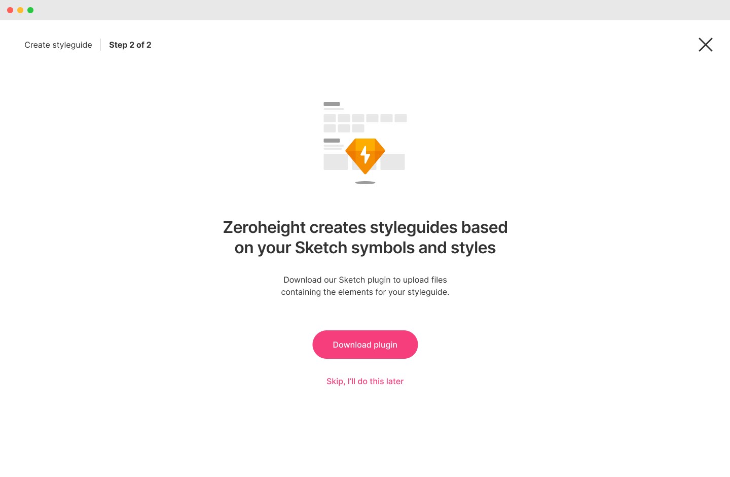
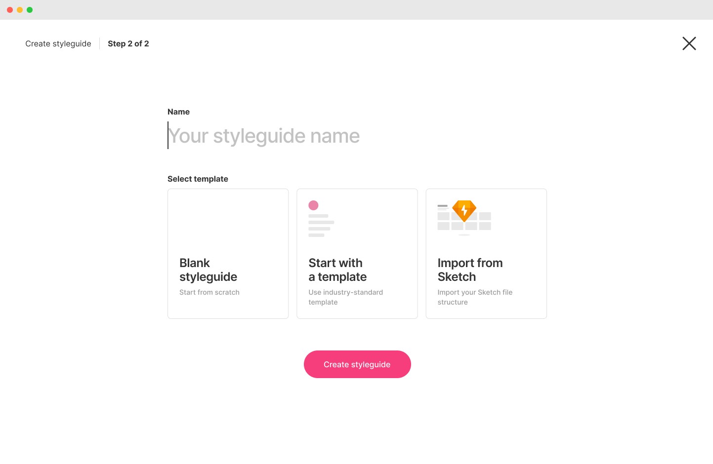
What users have seen when clicking on "Create new styleguide".
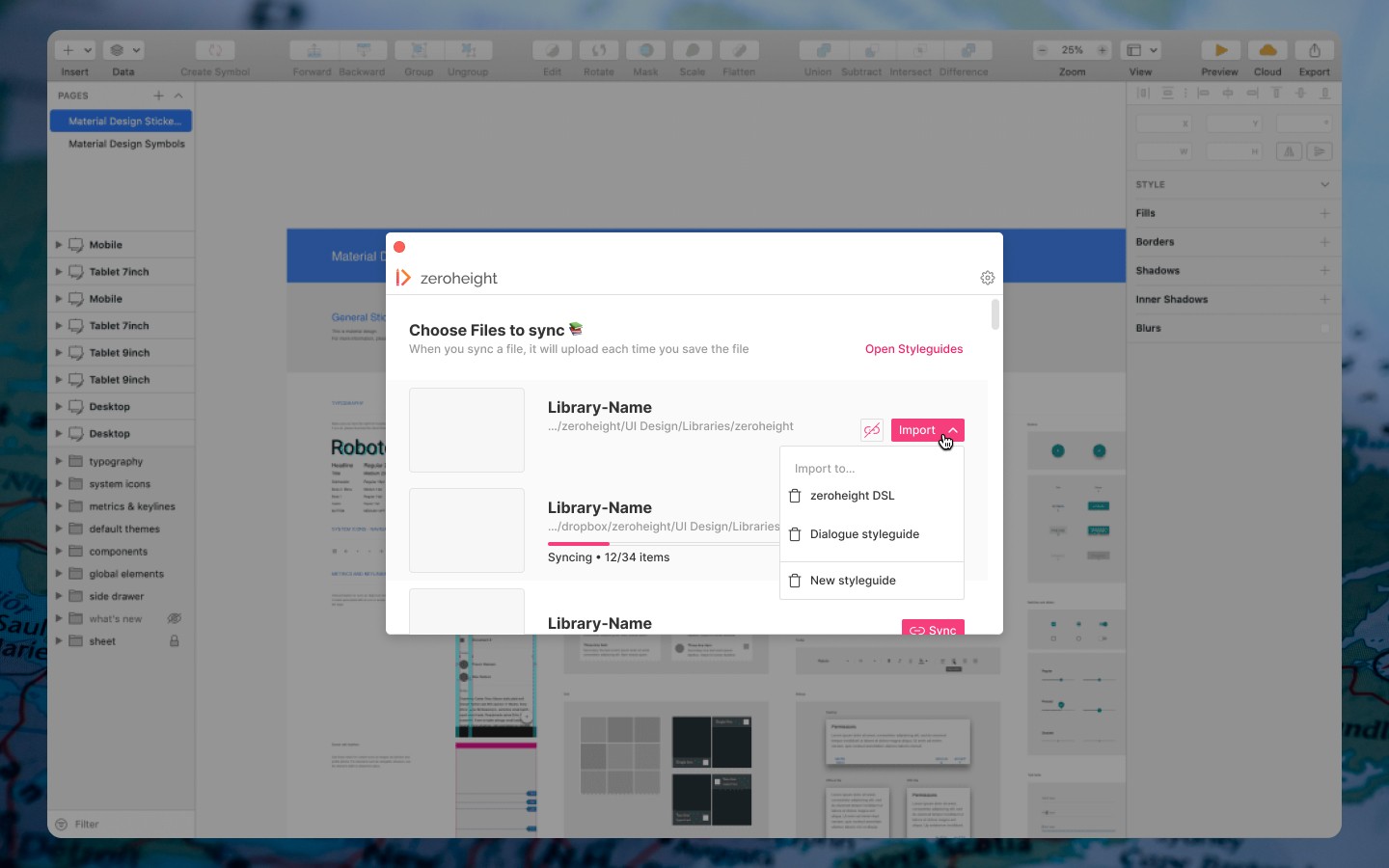
They would then upload a file via the plugin.
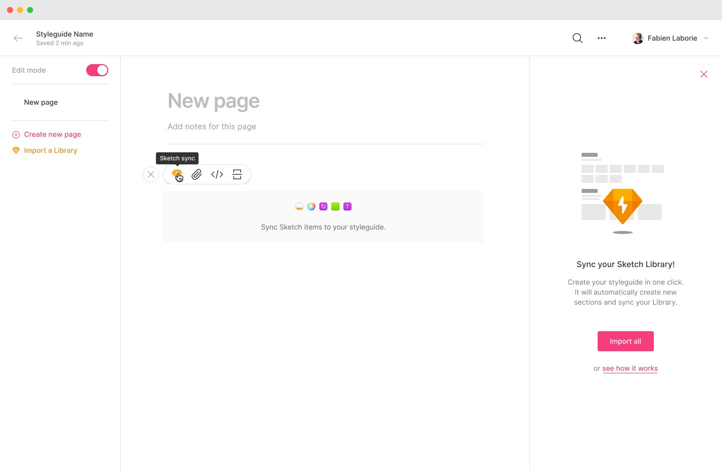
Right after creating their first styleguide, users were shown a blank page and different prompts to import their Sketch items.
A view of the Inserter they would interact with to update and modify their Sketch imports.
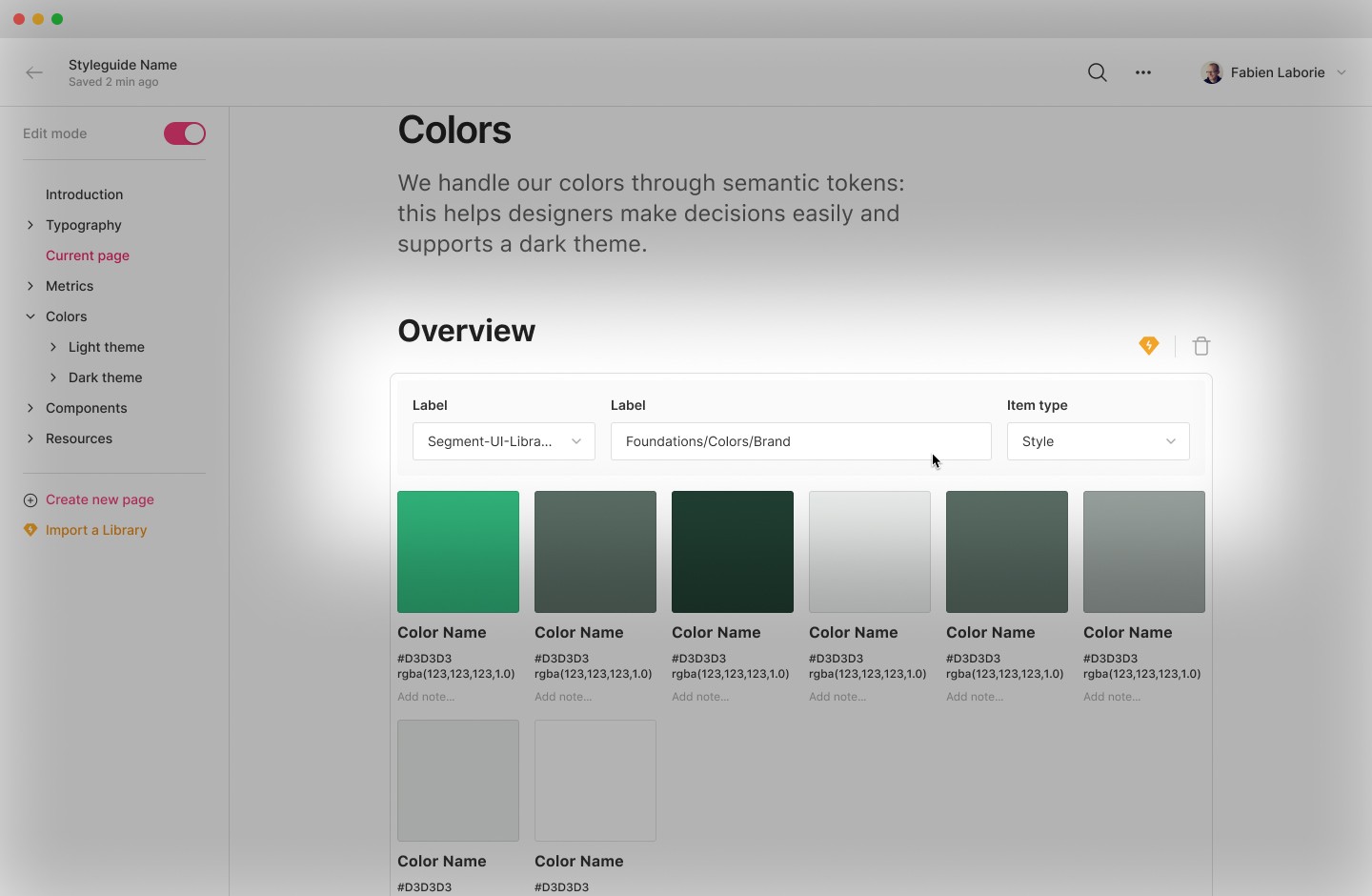
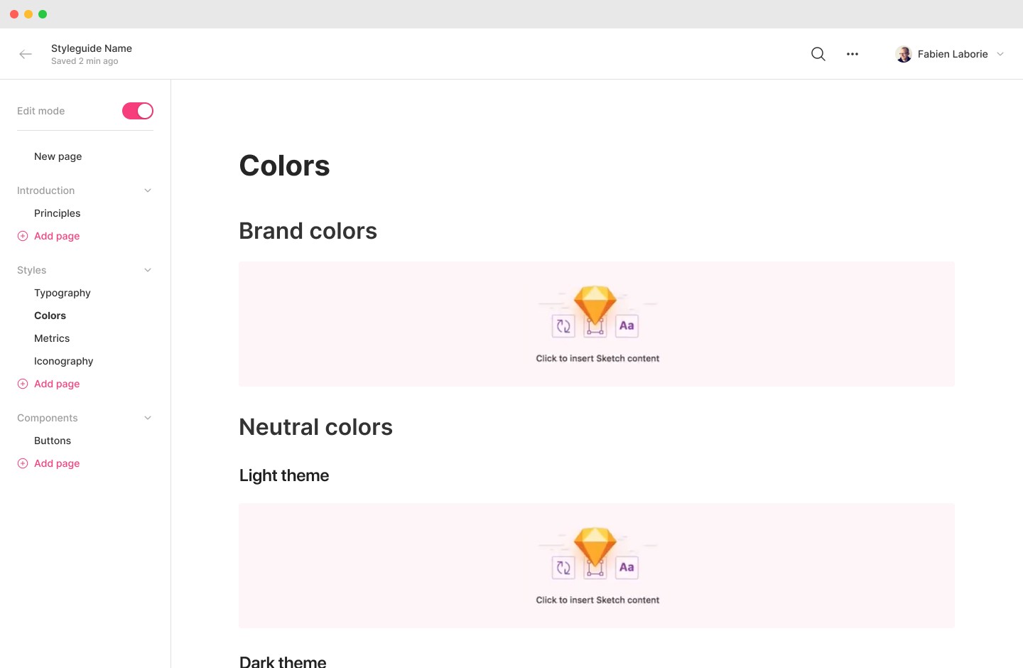
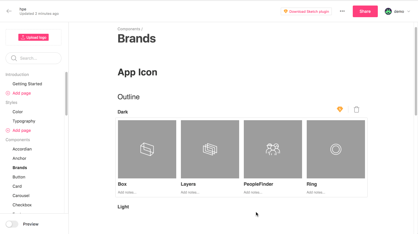
What a styleguide looked like with components uploaded and synced. On the right, all the components info imported from Sketch.
Testing the solution
I then conducted user interviews to test this design. Designers were stoked to have such a feature that removes the pain of having to manually enter and update their design system. However, a few major roadblocks emerged.

Users were trying to upload their artboards containing their styleguide because they didn't understand how it works.
Key learnings
3/8 users tried to upload sections of their design system such as Artboards (frames) instead of the entire file, because they were used to do it with other tools at the time.
4/8 users where confused because of the structure generated by the file.
3/8 users wondered where the original file was stored and the link between the styleguide and the design items.
It was evident that we needed to iterate and take a completely different direction.
Exploration
Second design iteration
This time, we let them experience the styleguide first, and then import their assets section by section.
In this iteration, we decided to stop forcing the user to use the full automated import from the start .
Instead, we built a more elaborate onboarding. I added different options: starting with a blank page, start with template and the automated import structure from Sketch.
The new user flow included template choice and ability to see sections with placeholders on a page.
Users would choose their preferred way of onboarding when creating a styleguide.
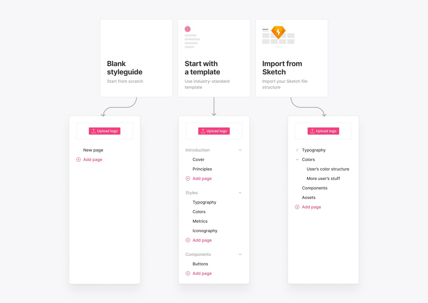
Each template led to different treebars.
We also tested including them in the cover.
We contemplated the idea of templates per page, but this would have been costly in development.
If user have chosen to start with a template, they would see common styleguide pages with a teasing of a structure, fronting empty states.
A different version of the empty states that we prefered to archive.
After an import, the placeholder shrinks to the size of the elements.
Key learnings
3/6 users had a hard time understanding that "import from Sketch" would create the styleguide automatically.
5/6 users preferred the template to start with: it gave them an industry-standard starting point. By nudging to fill in the blanks, they better understood the value of syncing their designs to quickly see results.
Exploration
Third design iteration
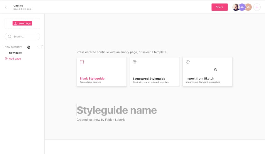
We chose to direct all users to a standard template.
In this round, we ensured everyone starts from the same point, and for Zeroheight, to build only what is the most impactful to reduce development costs.
We parsed 30+ of the best design system documentations and created an array of diverse pages to show them both good practices and Zeroheight's capabilities.

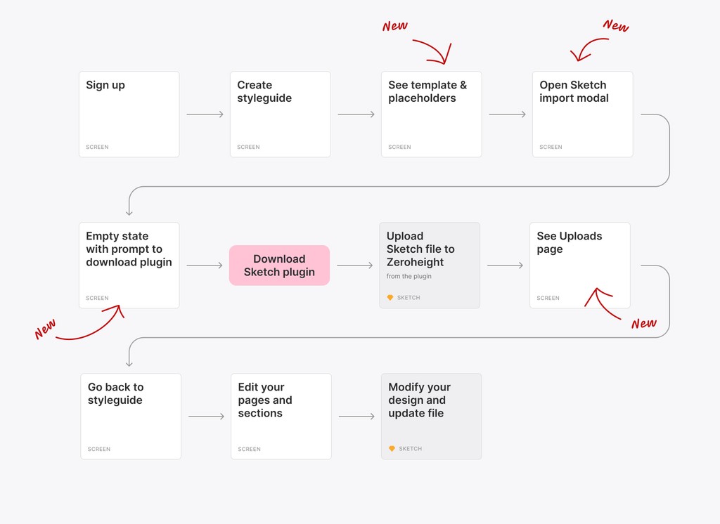
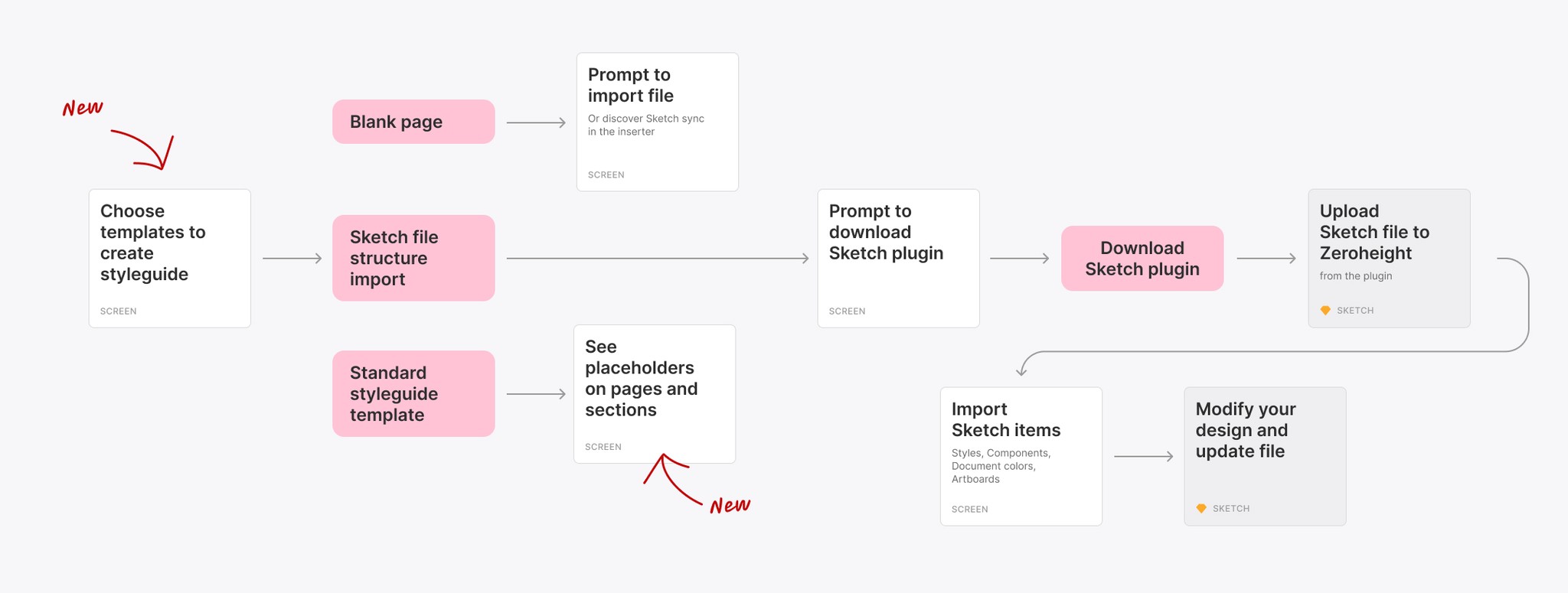
The latest version of the user flow introduces more steps for a better understanding of the feature.
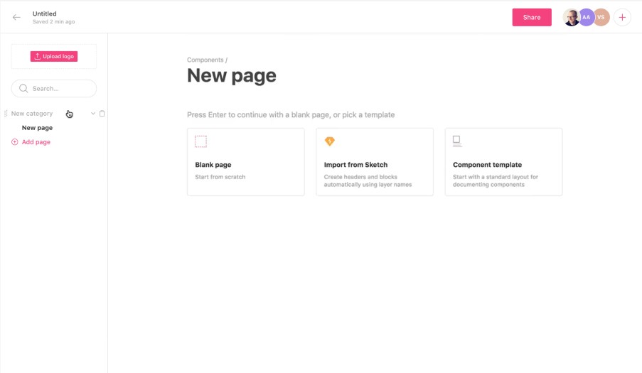
Introducting a new page for better control
During interviews, a problem emerged: users didn't know where they can manage uploaded files, and it was a flow breaker to do it in the plugin.
Users would also use one single file for multiple styleguides. (like Product and Marketing) or more commonly, multiple files in one styleguide (a library for icons, a library for marketing, etc.).
We decided to introduce a new step in the onboarding flow: the Uploads page.
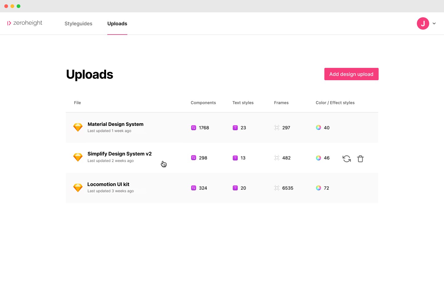
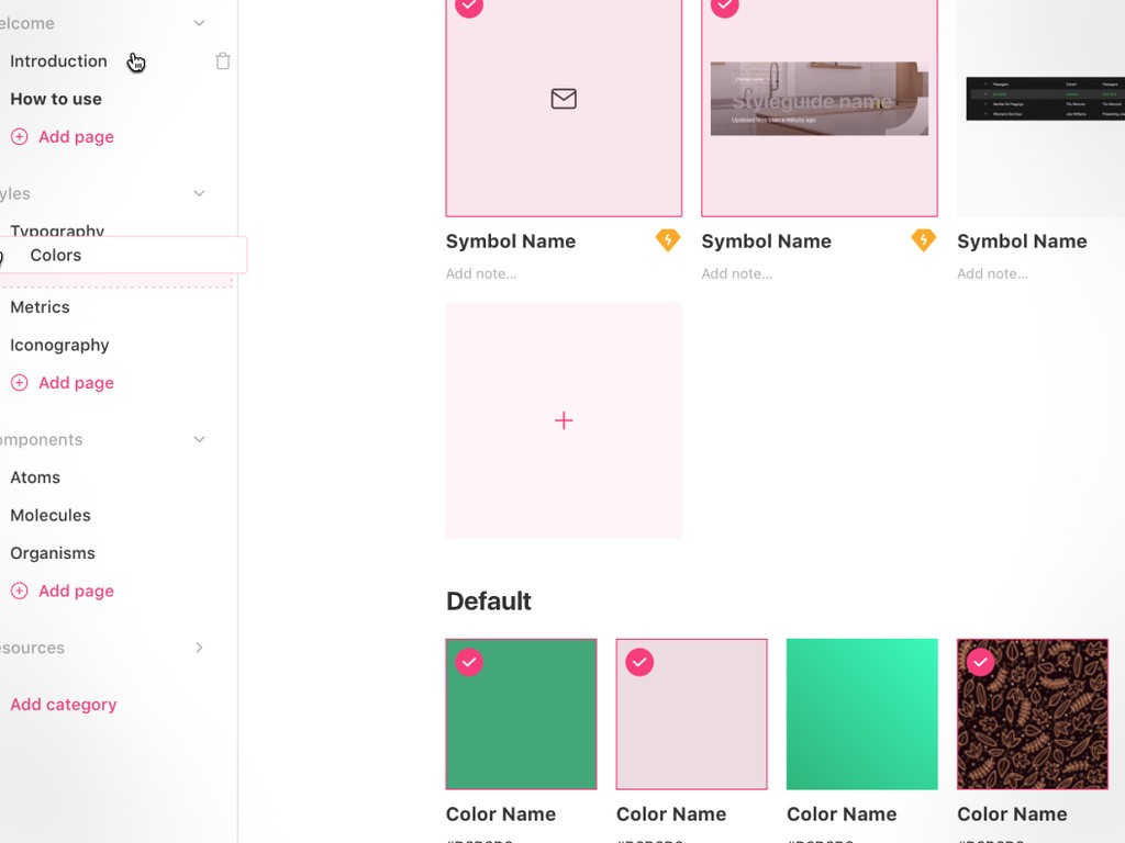
We created an Uploads page, a parking lot for all the user's files, where they can manage, update, and delete them. During onboarding, they are prompt to go back to their styleguide after reviewing their file here.
The introduction of a new insert modal
Problem: dropdown fields were confusing and too much of a different way to navigate their Sketch file.
Solution: we added visual representation that matches the structure of their design files, closer to what they would see in their design tool.
Our first version was a side panel, where we still used a dropdown, but introduced a new tree view.
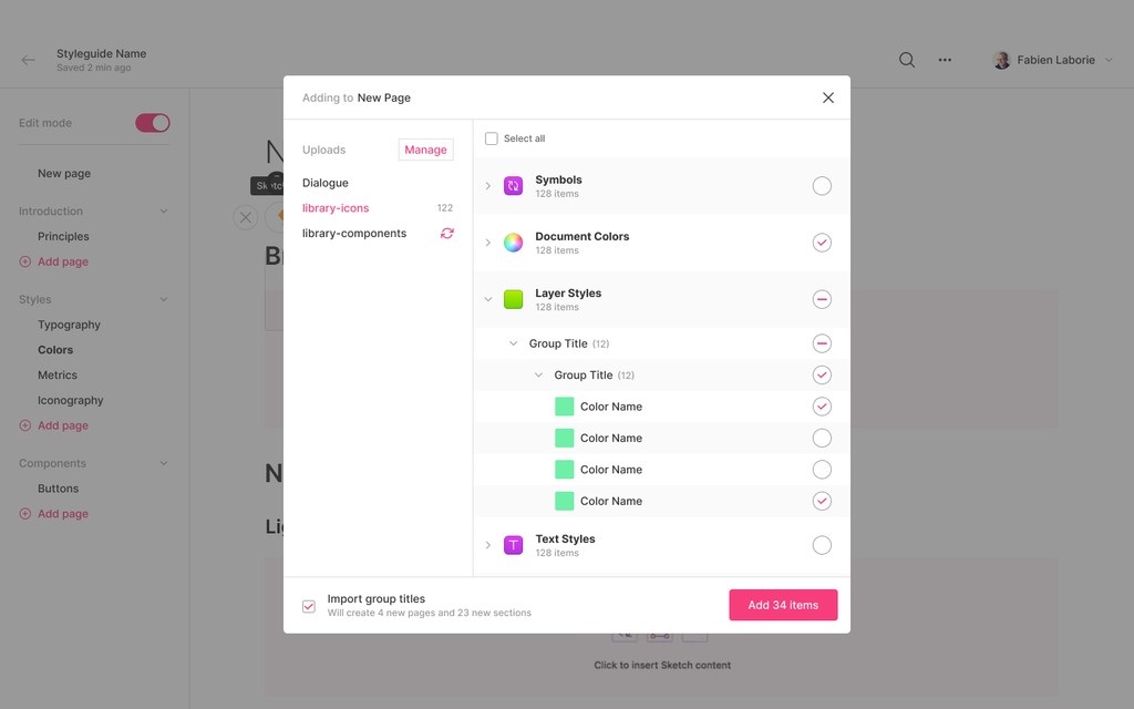
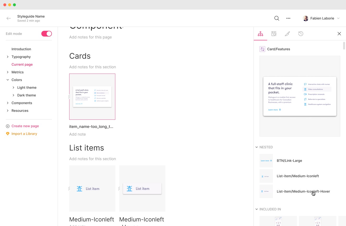
We then landed on a disruptive modal, including a few handy features like "select all" and "import group titles".
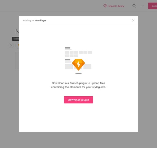
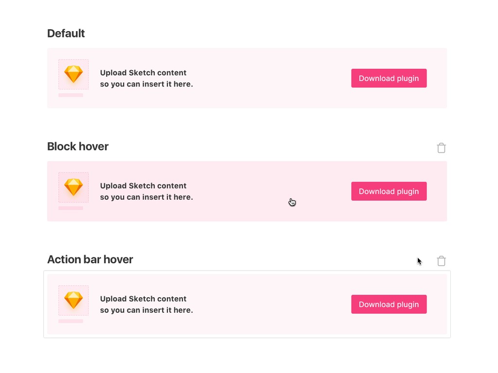
If users don't have the plugin, they see an empty state.
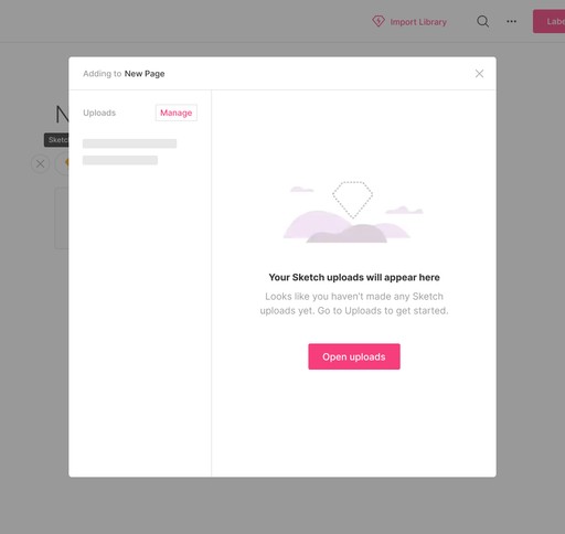
If users have downloaded the plugin, they've seen a prompt to upload.
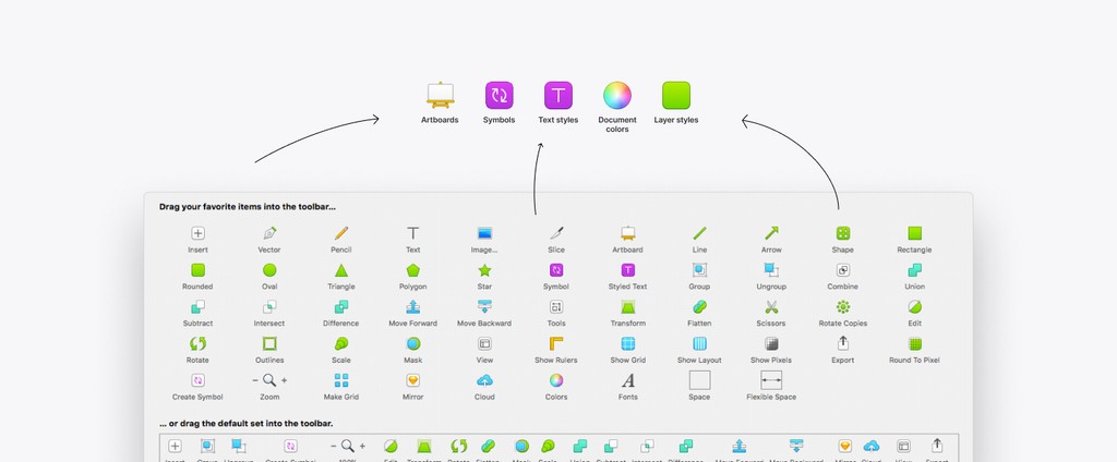
We used the same icons as Sketch to enhance familiarity.
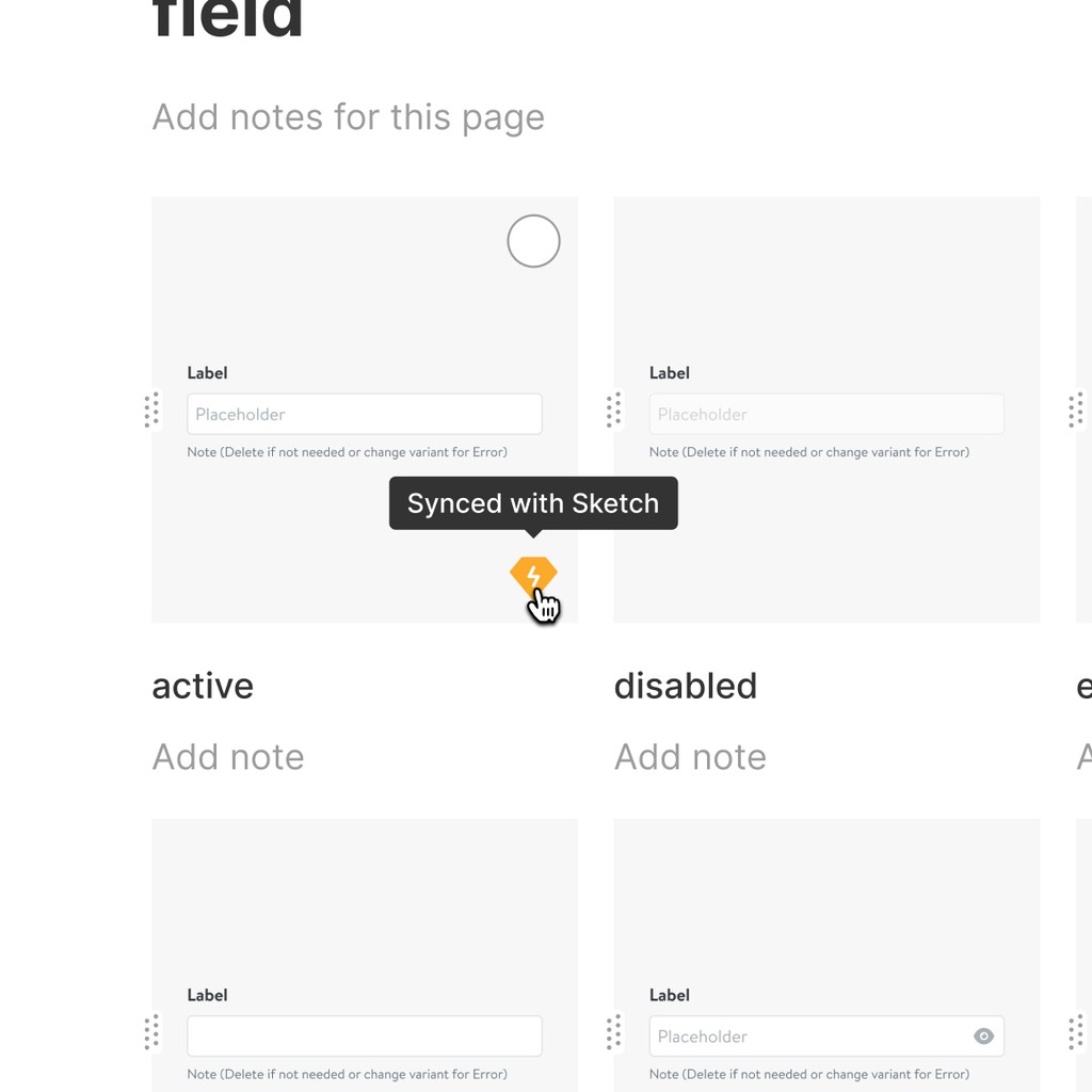
Once imported, we wanted users to see what was in sync with Sketch for easier updates.
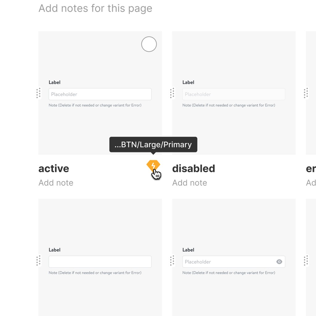
But iterating on it, we thought it was a better idea to show the URL of the item. That way, users could rename their item as they want in the documentation.
Key learnings
Insert modal was a success. Users understood it well, despite 2/6 not grasping on the idea of checkboxes. One of them even said "I feel at home" when looking at it.
Uploads page was a disturbing detour for 3/6 users but they understood where their uploaded file was.
Outcome
What happened next
Figma joining the party
A year after our release, Figma started to dominate the market. Fortunately for us, its integration with Zeroheight was a no-brainer: users would just have to paste a link, and voila! A major difference coming from the Sketch integration.
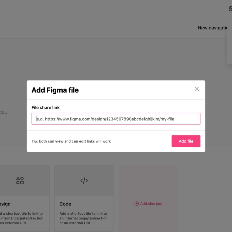
The benefit of Figma being an online tool: links!
We had to move away from the yellow Sketch logo, and iterated on different icons representing Styles and Components.
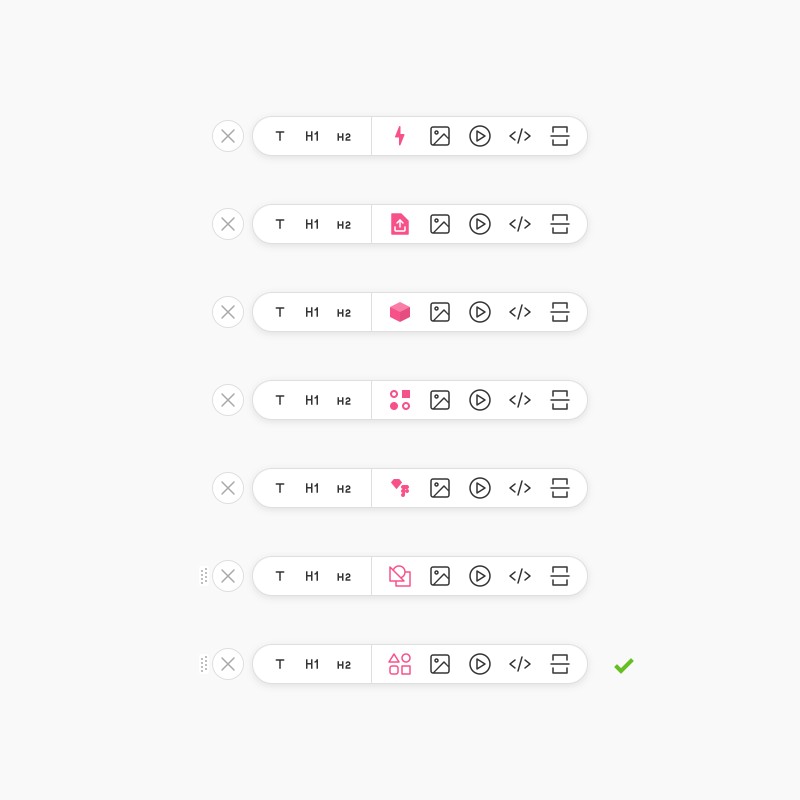
A myriad of new features
Shortly after, we released a few game-changing features: Storybook integration, Versioning, Design tokens, Comments, and even more customization options.
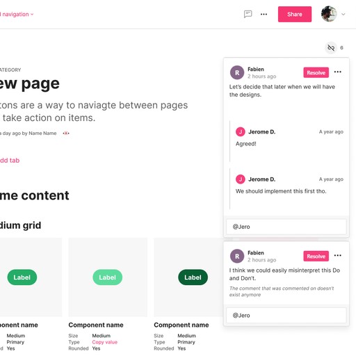
Comments implementation.
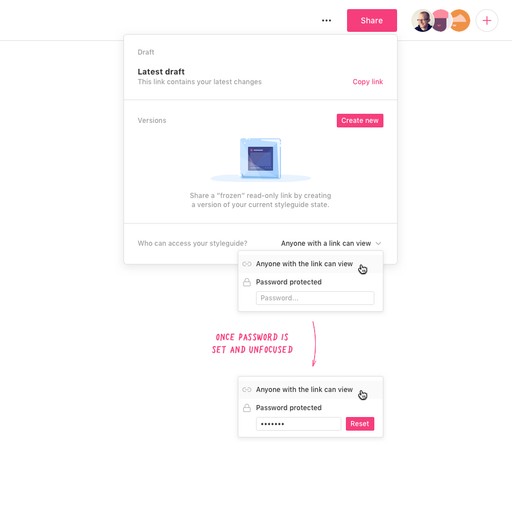
Versioning and password protection.
Section tabs for extensive documentations.
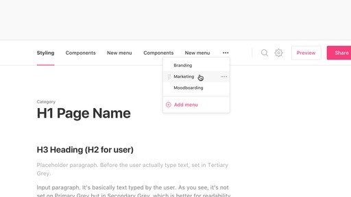
More and more customization options!
Outcomes
Based on these designs, Zeroheight 3.0 launched in October 4th, 2018, ranking #8 on ProductHunt.
Since then, Zeroheight is used by major brands such as Uber and Decathlon, and raised a $10 million Series A funding round.


Credits
Designers
Fabien Laborie
Robert Whitfield
Development
Jerome de Lafargue
Robin Tindale
Hampus Ahlgren
Management
Jerome de Lafargue
Robin Tindale